OVERVIEW
An old colleague requested my service to assist him with a project he was working and required a pitch deck using the assets his previous freelance designers came up with. Once I was edified on the scope of the project and what the app was all about, I showed my interest and value and was welcomed a spot on the team as a lead designer.
MY ROLE
PITCH DECK
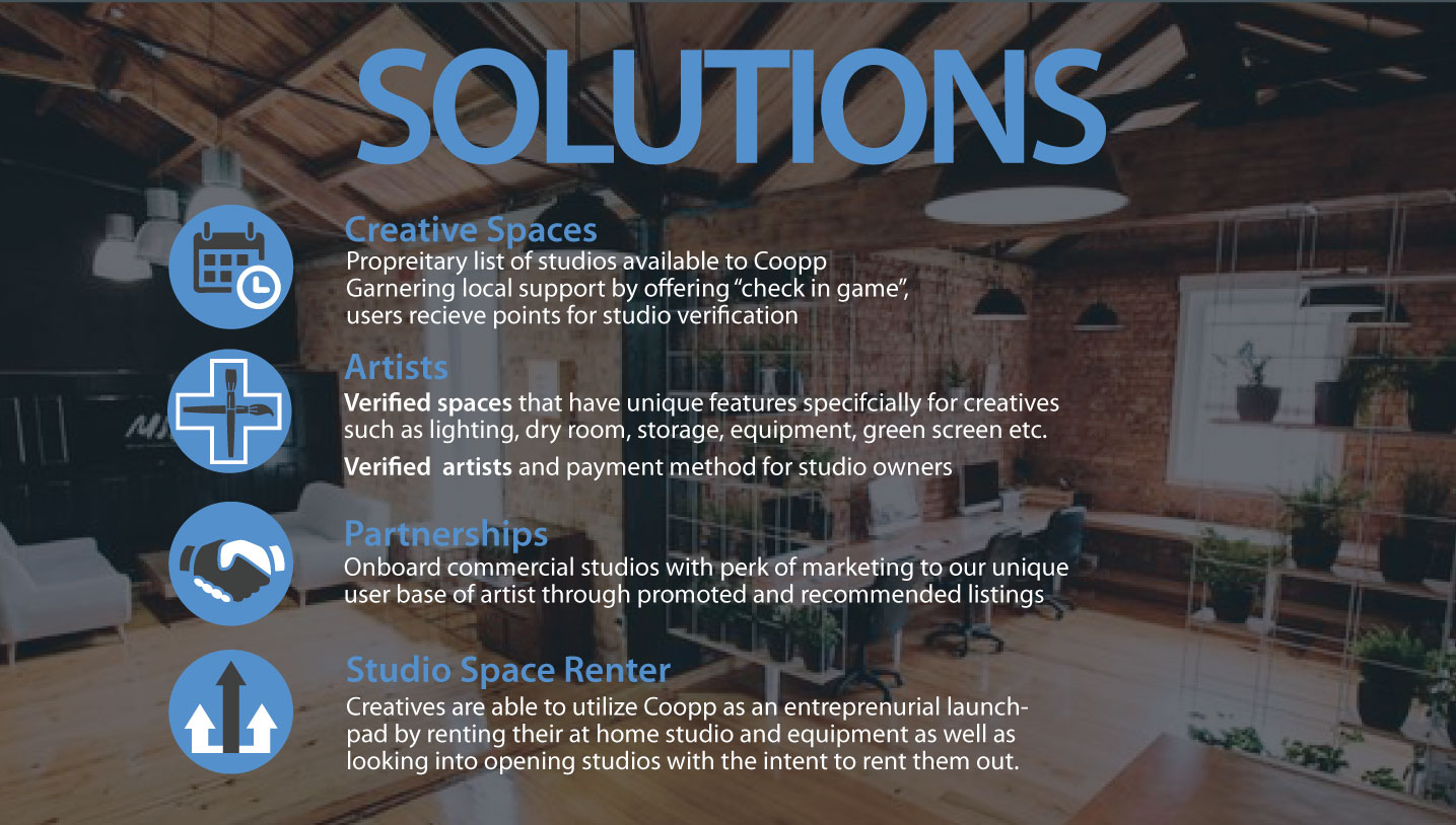
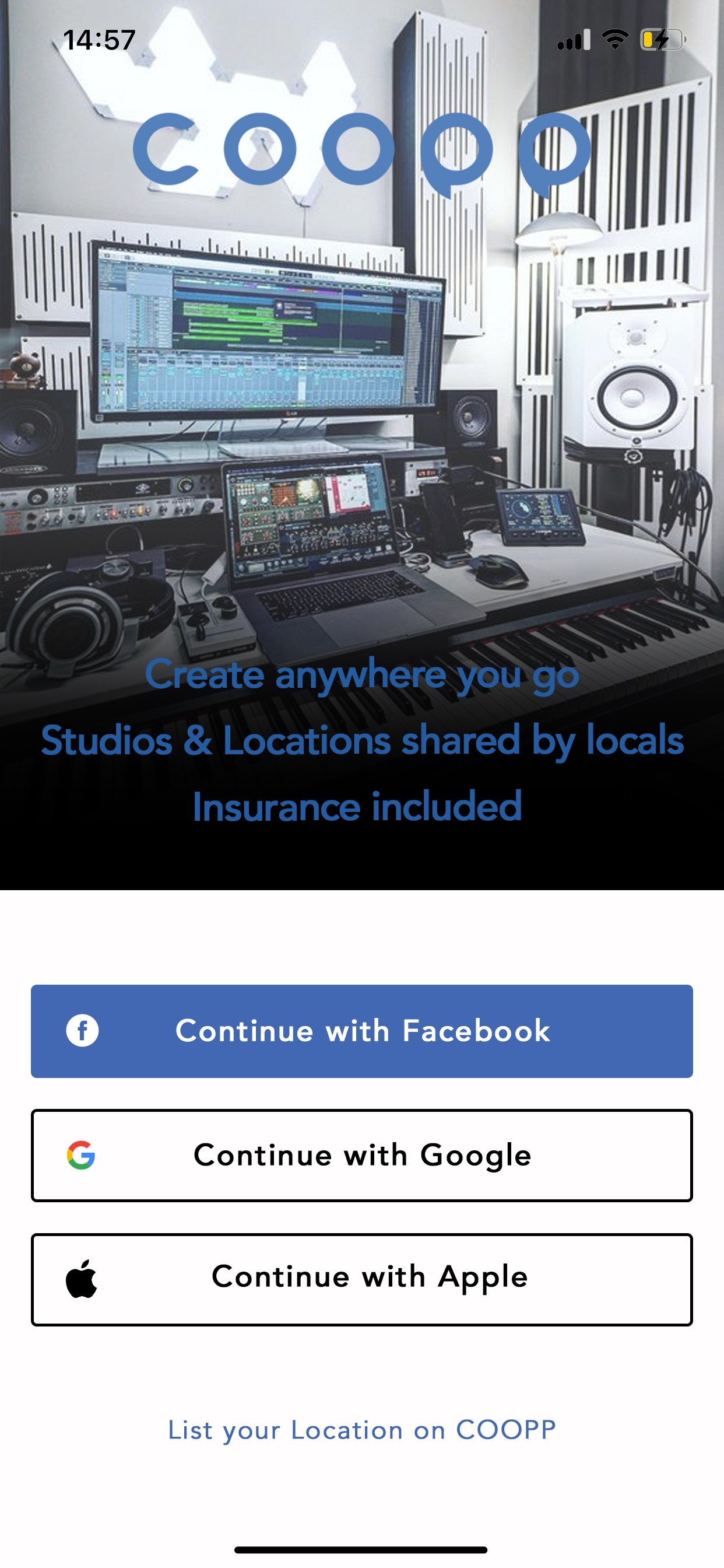
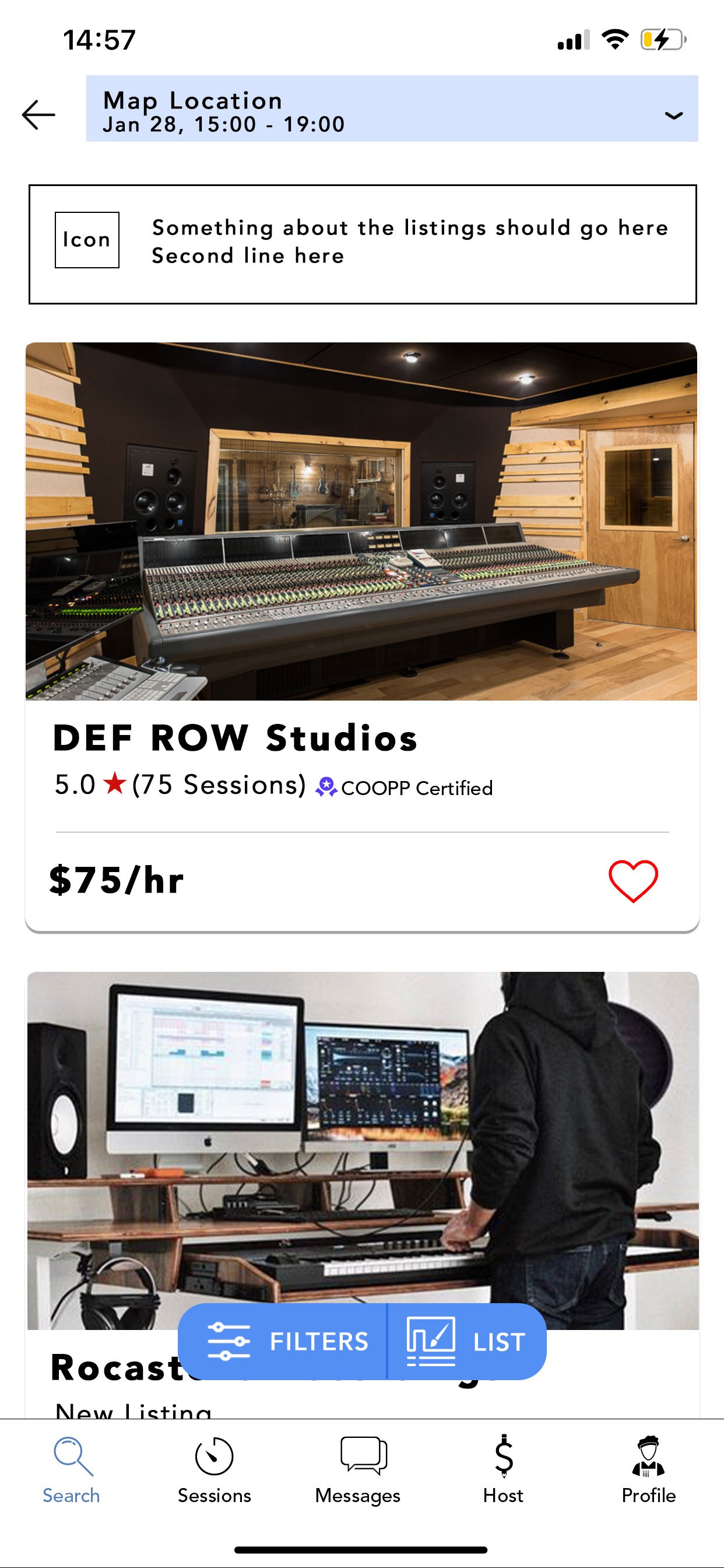
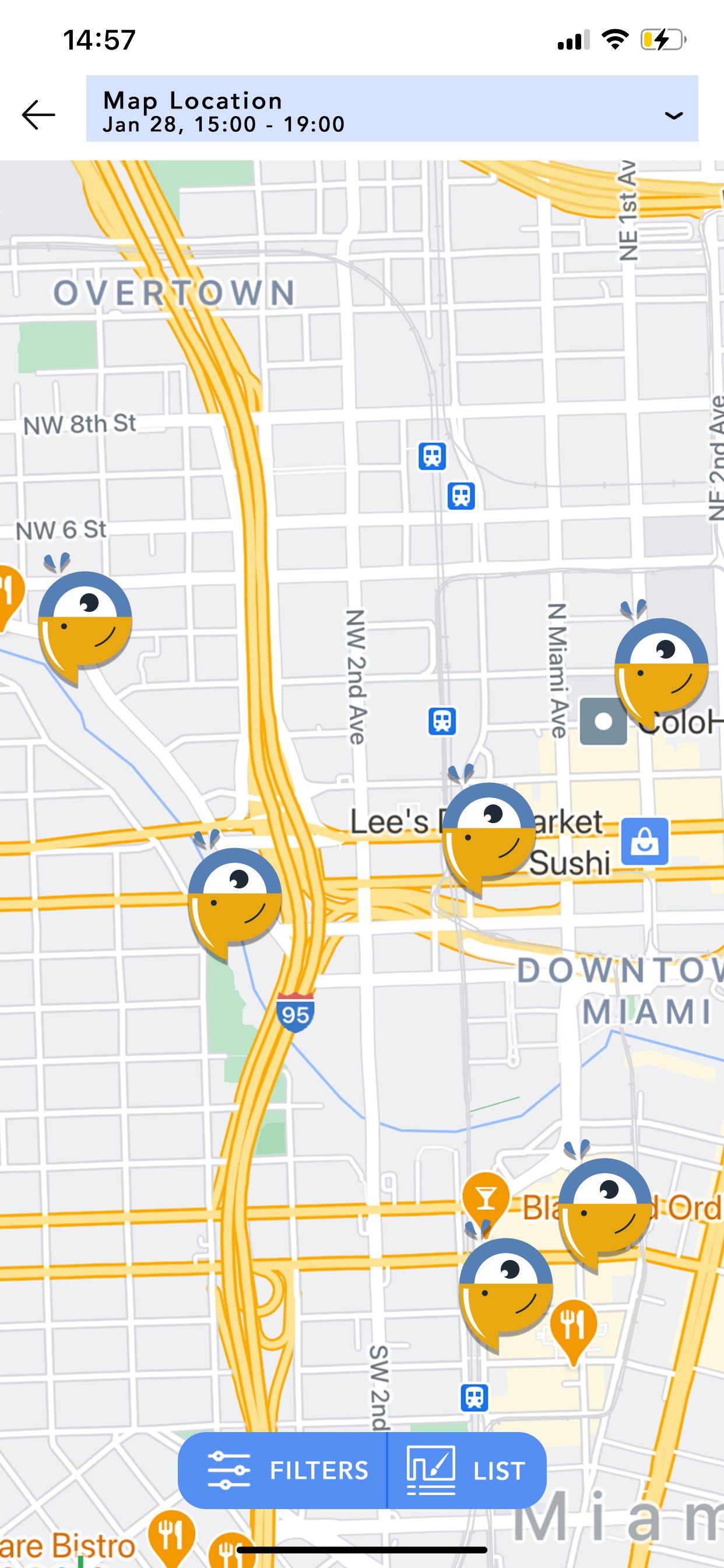
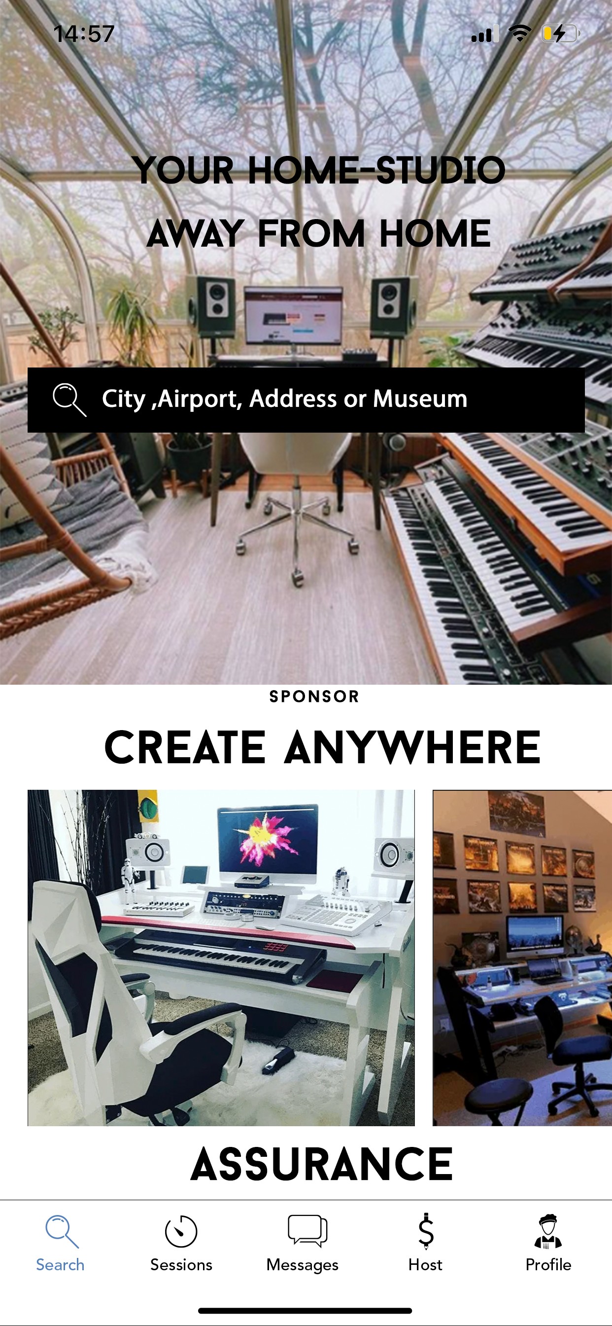
The full pitch deck consisted of 10 pages, for demonstration purposes I have only included a few of the key pages for the general consumer on this page.
CREATION
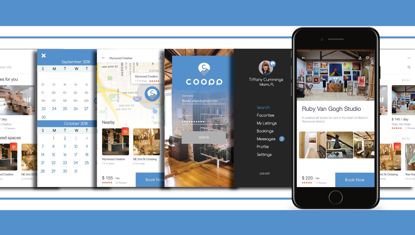
After multiple meetings with the founder and affiliates, we came to a general agreement as to which direction to move with the app in terms of usage and which functions would kept or scrapped. Skipping over the most basic wireframing methods, we agreed on using a few different apps finished screens that were most aligned with the pages and functions we needed for inspiration and made the look and feel unique to our app.
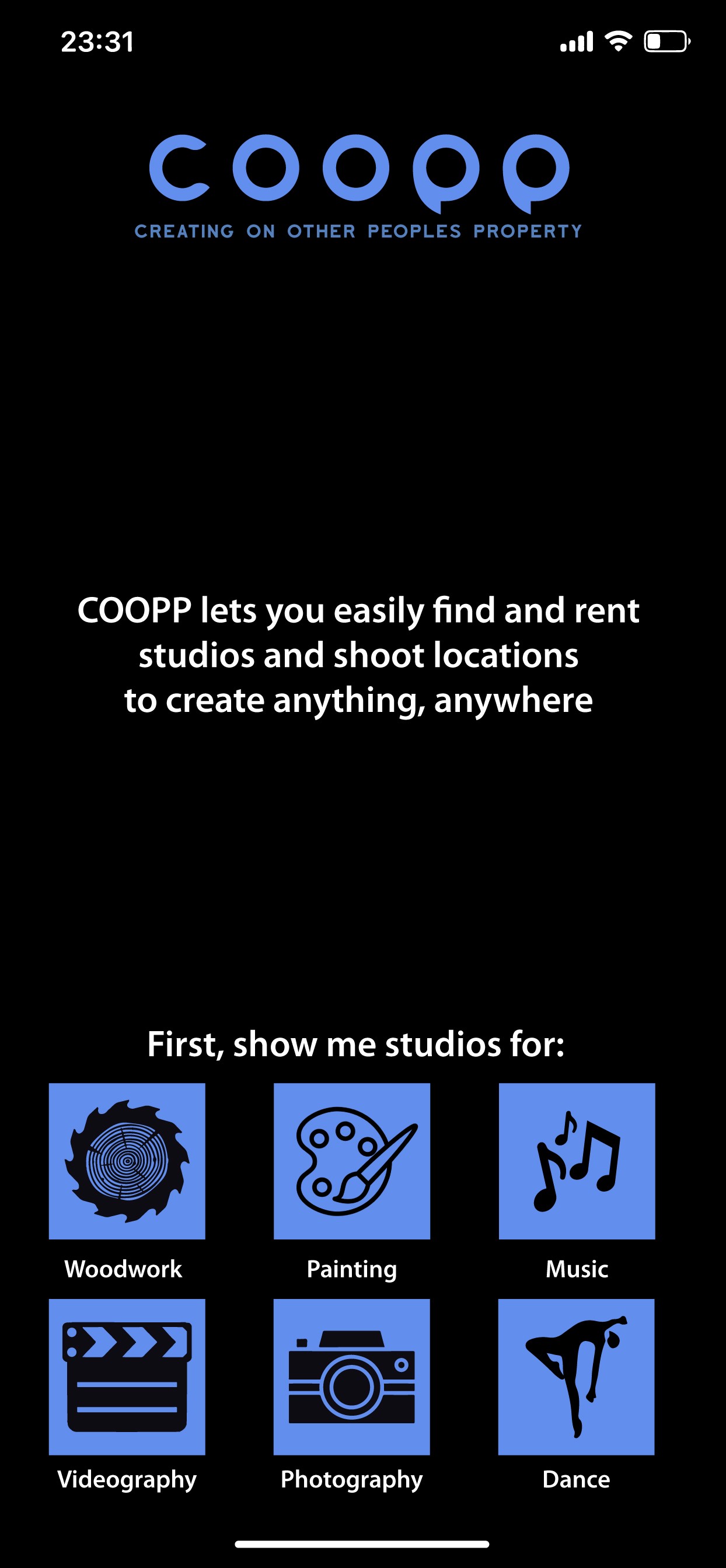
The Slides presented below are the most updated versions of the screens that were in made at the time.

LOGO TRIALS
Pictured here are the initial logo concepts for when the project was still named Cabyn. Later after experimenting with concepts and marketing strategies we changed the logo and name altogether.
COOPER
Many successful companies and brands have mascots and caricatures to go with what they are offering to make them palatable for everyone. This was my attempt at making one, his name is Cooper and is a one colored Toucan purposely shaped like one of the P's in COOPPs logo

IDENTITY CRISIS
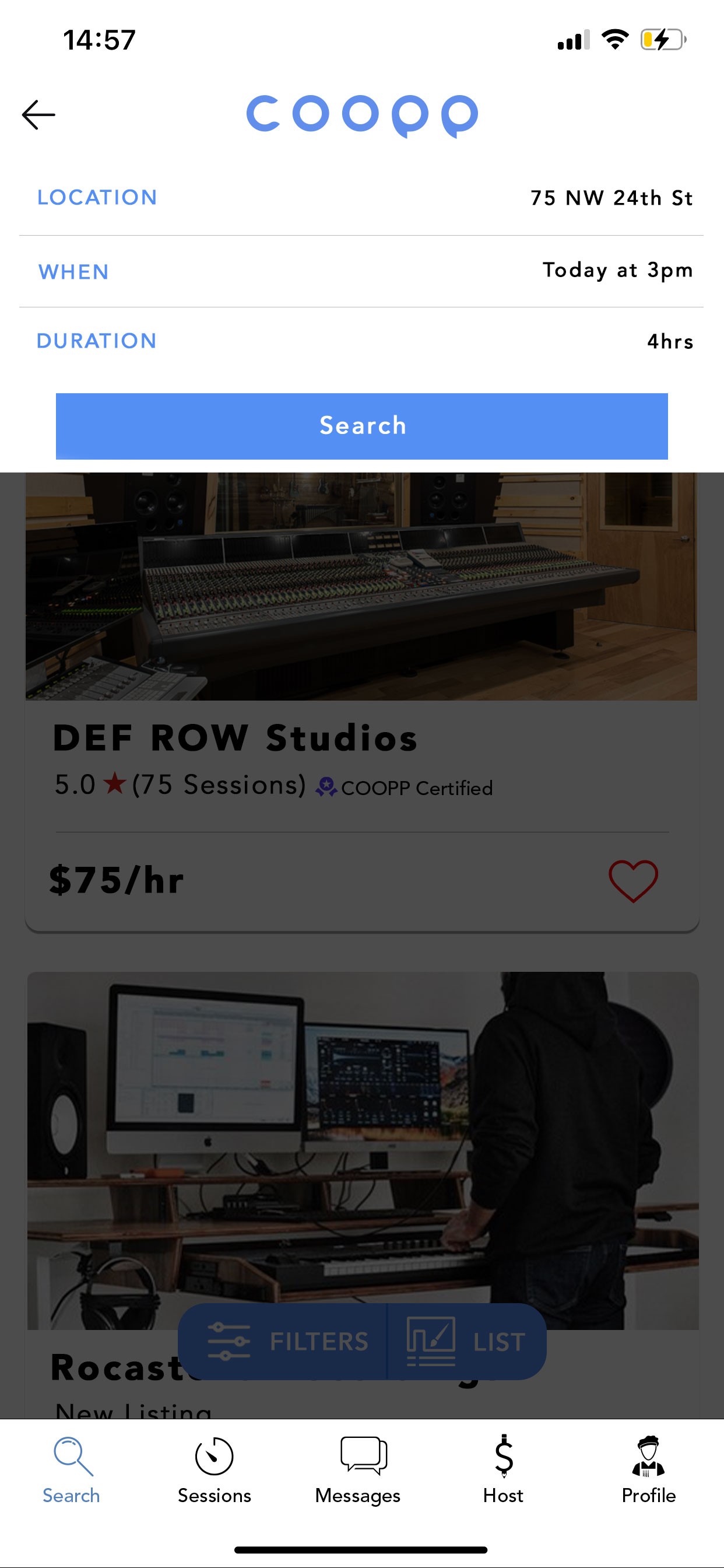
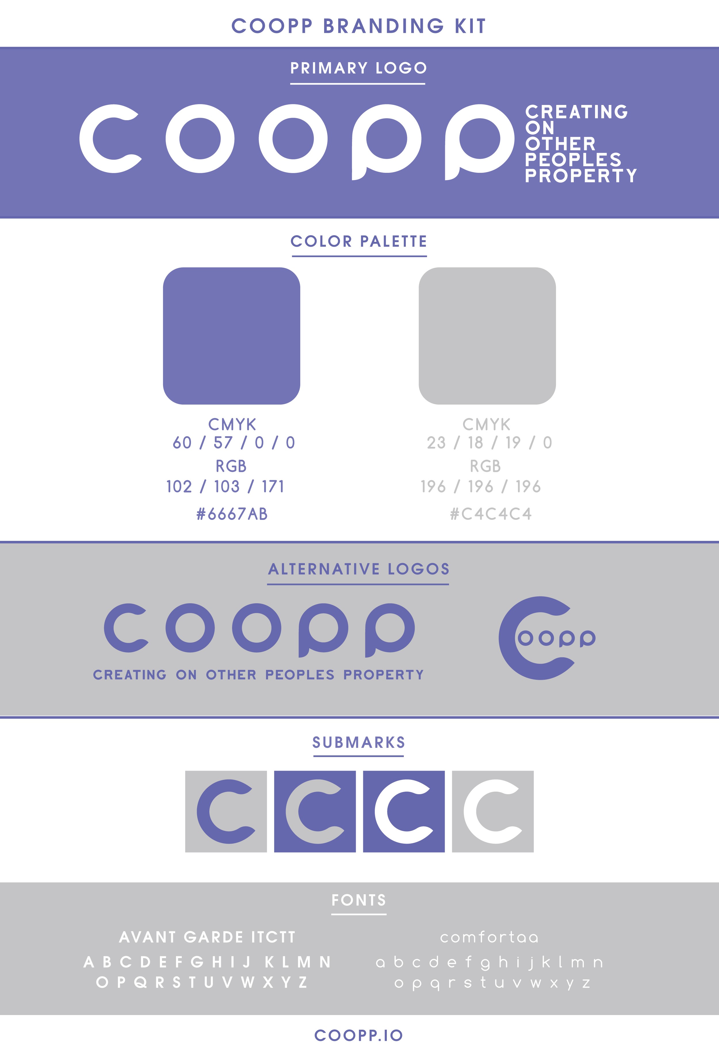
At the time of creation of the pitch deck, Coopp was still using the colorway of the original designers assets, which is why much of the logos you see are still in blue as opposed to purple as pictured in the branding guide

