Timeline
7 Weeks
My Role
UX/UI Designer
Deliverables
User stories
Wireframes
Prototype
Tools Used
Figma
Slack
OVERVIEW
Edufication is an app that notifies parents and School Faculty of upcoming events and activities that their children may be involved in. Keeping parents up to date with their children's lives
THE PROBLEM
Most Parents lives have been altered since covid, changing up the daily routines and lives of schools and their children's activities. Parents with more difficult scheduling and for children in co-parenting households to be informed without any stress was non-existent. There was no way of keeping all parties up to date
with what was going on with children's lives and activities with ease
THE GOAL
Ultimately, the goal is to enhance the overall well-being of children and create a more
efficient and supportive environment for co-parenting families.
The successful implementation of this goal would result in a streamlined communication process, reducing stress and confusion for parents and ensuring that both co-parents are well-informed about their children's academic, extracurricular, and social activities.
Research
MY ROLE
UX designer leading the app and responsive website design from conception to delivery
RESPONSIBILITIES
Conducting interviews, paper and digital wireframing, low and high-fidelity prototyping, conducting usability studies, accounting for accessibility, iterating on designs, determining information architecture, and responsive design.
PROBLEM SPACE
In an effort to bring clarity to this issue, I took the initiative to list down my assumptions, questions, and the specific information I was seeking on the matter.
The feedback received through research made it very clear that users would be open using an app that could notify them and update them on time changes to events and activities.
Ideation
I did a quick ideation exercise to come up with a few ways to create the wireframe of the app and determine what features would be most important.

DIGITAL WIREFRAMES
After ideating and drafting some paper wireframes, I decided the most effective route for this app would be determined on selecting exactly which events and activities to notify the parent about
LOW-FIDELITY PROTOTYPE
To prepare for usability testing, I created a low-fidelity prototype that connected the user flow of signing into
the app and creating a profile. I provided a link to the original draft of the prototype here.

USABILITY STUDY
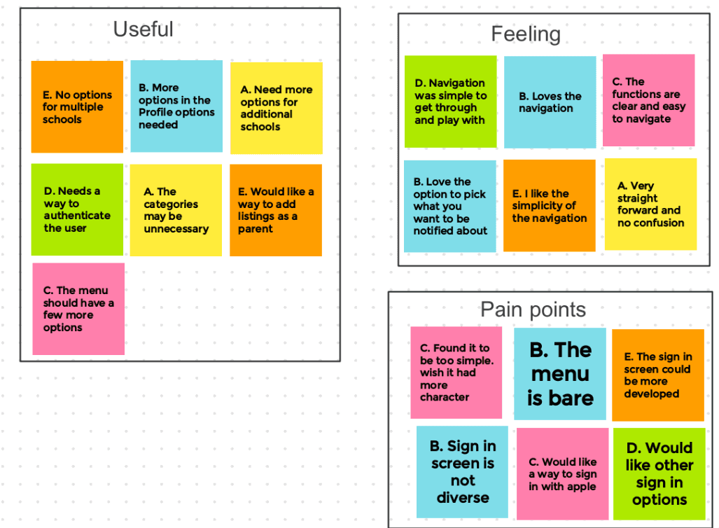
I then asked a few friends to independently use my prototype and respond to a few questions to see which features of the app they liked and how they felt about the process. The insights helped me to further develop the app to serve the masses
POST USABILITY STUDY
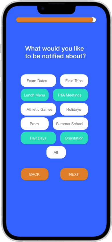
Based on the insights from the usability studies, I applied accessibility design changes. Such as adding bright and contrasting colors for visual impaired users on ce you select which items to be notified about

BEFORE

AFTER

HIGH-FIDELITY MOCKUP
The high-fidelity prototype followed the same user flow as the low-fidelity prototype, including design changes made after the usability study. View the prototype here


